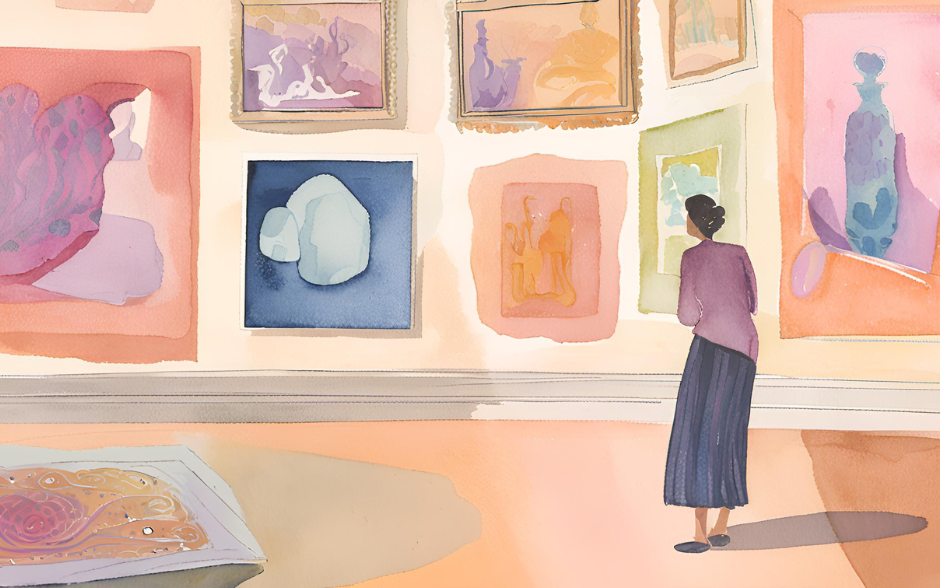
Analyzing works like Mondrian’s geometric art, Van Gogh’s Starry Night, and the color palettes of modern filmmaker Wes Anderson enables designers to draw inspiration and creatively apply it to their projects. This method of learning not only enhances color skills but also injects more creativity and depth into modern design.
Why Study the Color Palettes of Masters?
Emotional Communication Through Color
The timeless appeal of masterpieces often lies in their masterful use of color, which can instantly convey emotions and values visually. For instance, Mondrian’s use of vibrant red, yellow, and blue primary colors creates an abstract geometric aesthetic full of order, while Van Gogh’s Starry Night employs rich blues and yellows to express emotional turbulence and depth. These examples illustrate that color is not merely a visual element but a crucial tool for communicating emotions and brand values. Learning from these works helps designers infuse emotion into their projects, making them more captivating and persuasive.
Historical Value and Influence of Color Palettes
Classic design works not only reflect the cultural context of their time but also lay the foundation for future design trends. For example, the minimalist color principles of the Bauhaus design style are still widely applied today, while the retro tones of Wes Anderson’s works have become benchmarks of contemporary aesthetics. By studying these historical classics, designers can unearth deeper creative inspiration and transform it into modern, innovative works, achieving a seamless blend of past and future.
Analyzing Color Palettes in Classic Design Works
Work 1: Mondrian's Abstract Geometric Paintings
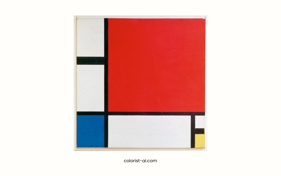
Mondrian's abstract geometric paintings center around red, yellow, and blue primary colors, combined with black lines and white spaces, creating a minimalist and modern aesthetic. This approach to minimalist color design not only enhances visual balance but also emphasizes the purity of each color. Designers can learn from this to use a limited palette to create impactful visuals and develop a clear, recognizable style in branding.
Work 2: Van Gogh's Starry Night
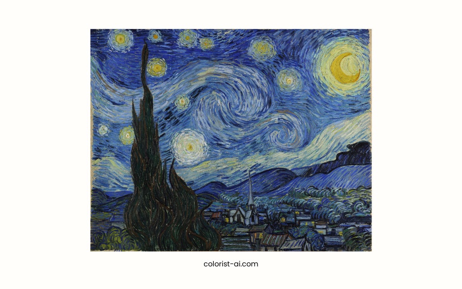
Van Gogh's Starry Night features a deep blue background paired with bright yellow stars, creating a dramatic visual contrast that conveys emotional tension and dynamic energy. The blue represents the calmness and depth of night, while the yellow symbolizes hope and vitality. This contrasting color approach is ideal in modern design for creating focal points or conveying emotional messages in advertising.
Work 3: Bauhaus Design Style
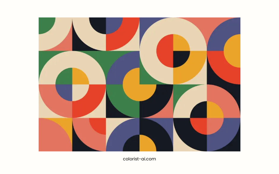
Bauhaus design style is renowned for its functionality and simplicity. Its color palette focuses on primary colors such as red, yellow, and blue, supplemented by neutral tones like black, white, and gray to emphasize practicality and readability. These principles are still highly applicable in contemporary UI design, especially for enhancing the visual hierarchy and focus of interface elements. Designers can draw from Bauhaus philosophy to create clean and efficient designs through simple color schemes.
Work 4: Wes Anderson's Movie Posters
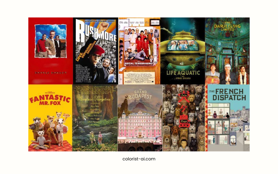
Wes Anderson's movie posters are known for their soft tones and retro palettes, often featuring colors like pink, beige, and light blue to create a warm and nostalgic atmosphere. His approach emphasizes harmony among colors, forming a branded visual language with a distinctive style. Designers can learn how to use soft tones to convey a brand's personality and emotion, and enhance emotional resonance with target audiences.
Applying Color Techniques from Masterpieces
Methods for Extracting Color Inspiration
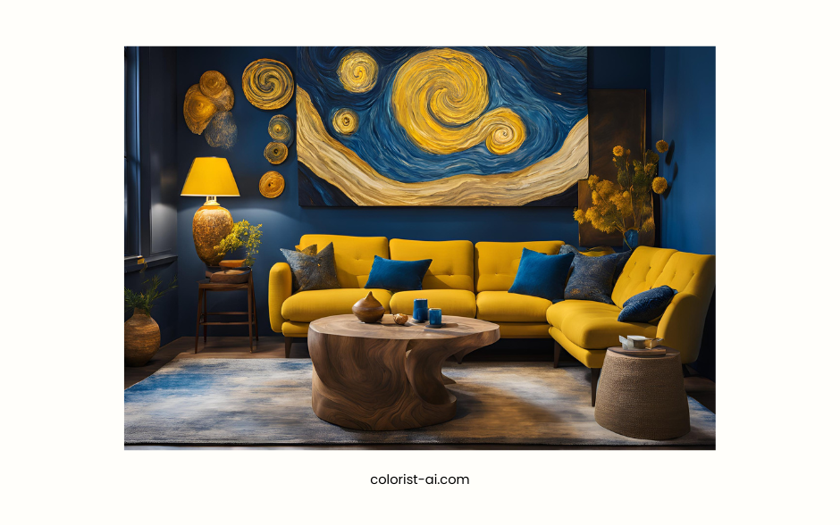
Extracting color inspiration from masterpieces is a practical design strategy. Designers can observe the primary and secondary colors in the artwork, analyze their proportions and applications, and adapt these elements into their own designs. For instance, extracting deep blue and bright yellow from Van Gogh’s Starry Night for use in digital designs of nighttime scenes blends a sense of classicism with modernity. This approach helps designers learn how to apply colors effectively in various contexts, creating visual effects with greater depth and complexity.
Utilizing Color Tools
Digital tools significantly simplify learning and applying color techniques. Tools like Adobe Color and Coolors enable designers to upload images of masterpieces, analyze their color palettes, and generate coordinated schemes. Designers can tweak the brightness, saturation, and contrast to create unique applications. These tools also support saving and sharing color schemes, improving efficiency in collaborative projects.
Importance of Testing and Practice
Integrating color inspiration from masterpieces into your own design requires consistent testing and practice. Designers should experiment with applying masterful color techniques to projects like branding, website interfaces, or advertising visuals and adjust color schemes based on real-world results. Through continuous practice, designers not only sharpen their color sensitivity but also develop a distinct style, enabling them to create work that is both creative and expressive.
How to Make Color a Core Competitive Advantage in Design
Developing a Personal Color Style
Establishing a personalized color style is key to making design work stand out. Designers can draw inspiration from the works of masters and combine it with their own creativity and design language to form a unique color identity. For example, using Wes Anderson’s soft color palettes and incorporating modern design elements can create visuals that feel both cozy and stylish. A personalized color style helps designers build a clear brand image in the market and attract more target audiences.
Blending Color Trends with Classic Palettes
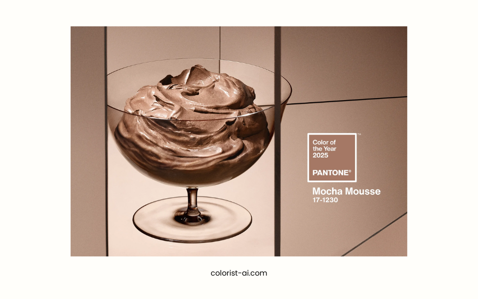
Following modern color trends in design ensures a sense of timeliness, while integrating classic palettes adds cultural depth to your work. For instance, Pantone's Color of the Year serves as a rich source of inspiration. Designers can merge these contemporary trends with the timeless colors of Bauhaus to create pieces that are both trendy and enduring. This blending approach not only appeals to modern consumers but also ensures the design remains timeless, becoming a masterpiece that transcends eras.
Learn from the Masters, Innovate Continuously
The color schemes of classic design works not only showcase the endless charm of color but also provide a wealth of learning resources for designers. By studying the masterpieces, designers can find balance and breakthroughs in visual language. The key is to integrate these techniques, combining contemporary needs with personal style, and apply them flexibly across various design projects to consistently create engaging and practical works.
Draw Inspiration from Classics to Create Future Possibilities
The color schemes of classic designs convey more than artistic beauty; they serve as timeless sources of inspiration. Designers should boldly combine classic elements with innovation, diving deep into the study and practice of masterworks to create designs that respect tradition while aligning with modern aesthetics. Drawing inspiration from classics will open up more possibilities for the future of design, giving each work a unique and lasting value.
