In this article, we’ll introduce several practical color practice methods to help you easily master the art of color coordination.
The Basics and Importance of Color Coordination
Why Is Color Coordination Crucial for Designers?
Color coordination is not just a decorative element in design; it directly impacts the effectiveness of the design and user experience. A well-crafted color scheme can:
- Convey Emotions:Evoke emotional resonance in the audience through color, such as red conveying passion and blue bringing calmness.
- Enhance Visual Appeal:Capture the audience's attention and enhance the depth of the content, making the design more striking and engaging.
- Strengthen Brand IdentityBrand colors help users quickly recognize your brand among competitors and enhance brand recall.
For designers, color coordination is a vital tool for conveying visual language, and improving this skill can significantly enhance design quality.
Review of Basic Color Concepts
Before practicing color coordination, designers need to understand some basic color theories, including:
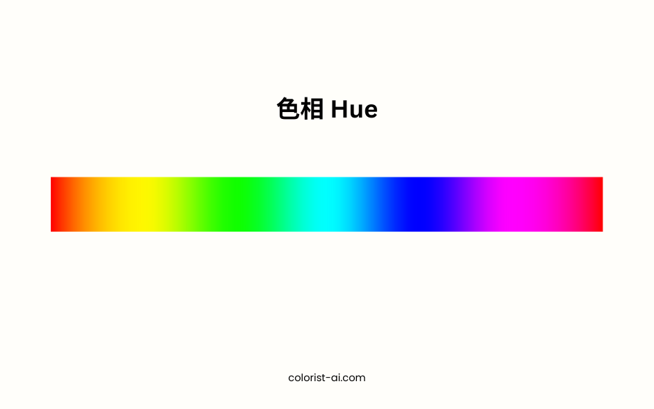
- Hue:Refers to the type of color, such as red, yellow, and blue. Hue is the foundation of color coordination.
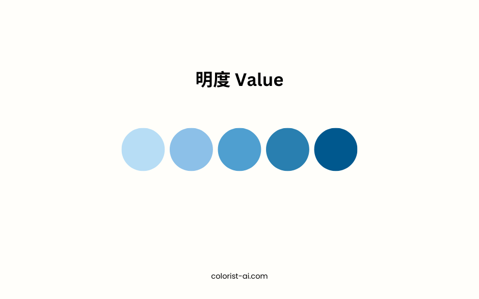
- Value:The brightness or darkness of a color, affecting the depth and contrast of a design.
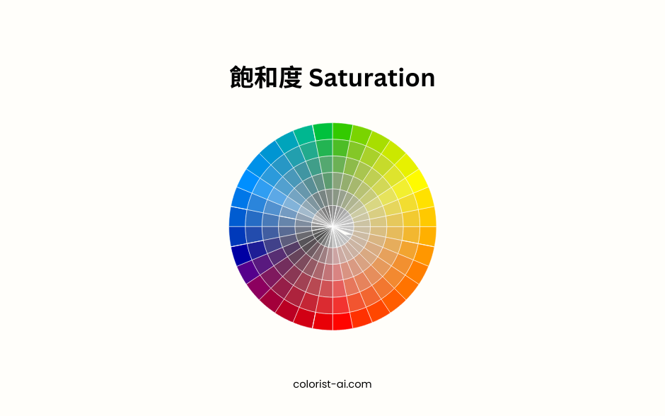
- Saturation:The purity of a color, determining its level of vibrancy.
These concepts help designers approach color selection and combination with greater logic and creativity. By gaining a deeper understanding of these theories, designers can more flexibly use colors to achieve their design goals.
Three Key Methods to Practice Color Coordination Skills
Draw Inspiration from Nature's Colors
Nature is a treasure trove of inspiration for designers, offering a wide variety of color combinations. For example:
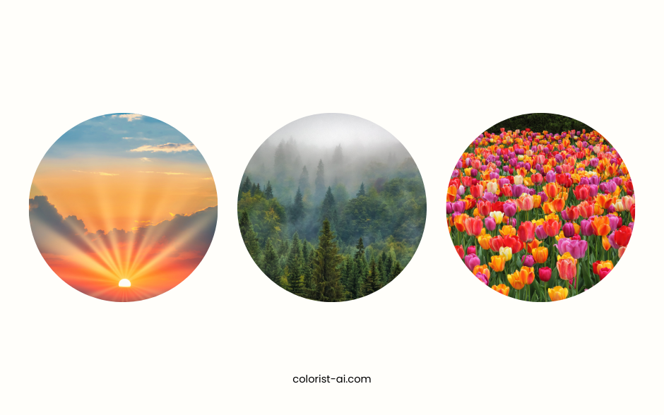
- Sunrise and Sunset:Warm red and orange tones combined with soft purple and blue hues create an atmosphere of romance and hope.
- Forests and Grasslands: Various shades of green combine to convey a sense of nature and balance.
- Flowers and Oceans: Vibrant floral tones paired with the reflections of deep and light blues showcase a harmonious contrast.
Designers can capture photos or use color-picking tools to extract primary and secondary tones from these natural scenes, incorporating them into website design, posters, or branding to enhance a natural and harmonious atmosphere.
Breaking Down Classic Design Cases
Classic design cases provide excellent learning templates. Designers can analyze the color schemes of the following types of works:
- Masterpieces of Art: For example, Mondrian’s geometric abstract paintings use primary colors—red, yellow, and blue—to showcase simplicity and balance.
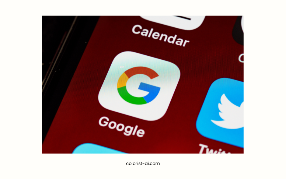
- Brand Colors: Google’s brand design employs four vibrant colors—red, yellow, blue, and green—to convey a message of innovation and inclusivity.
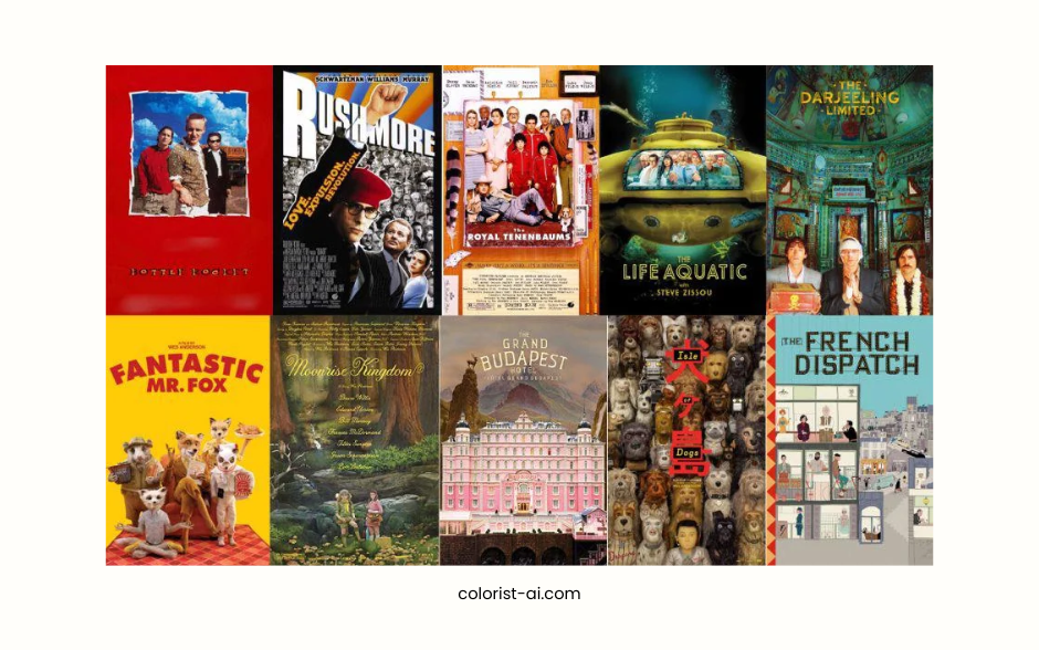
- Movie and Advertising Posters: Use color to create atmosphere, such as the soft, vintage tones in Wes Anderson’s movie posters.
Breaking down these examples helps designers understand how colors are applied in different contexts and inspires their own creative ideas.
Imitating Classic Designs
Imitation is the starting point for learning and an effective way to enhance color coordination skills. Designers can:
- Choose a Favorite Design: Such as well-known brand websites, graphic designs, or masterpieces of art.
- Replicate the Color Scheme: Try to replicate how primary, secondary, and accent colors are proportioned and applied.
- Create Original Work: Add personal style to the imitation, adjust color proportions, or introduce new elements to create designs distinct from the original.
Through imitation and recreation, designers can quickly master color coordination techniques and gradually develop their unique color styles.
Using Tools to Enhance Color Coordination Skills
Recommended Color Tools
Efficient color tools help designers quickly generate and test various color schemes. Here are some practical tools:
- Adobe Color: Offers a wide selection of color modes, supports extracting palettes from images, and seamlessly integrates with Adobe Creative Cloud.
- Coolors: Easy to use, allowing quick generation and saving of color schemes with simple slider adjustments, perfect for beginners.
- Canva: Built-in color tools make it easy to choose suitable colors for design projects and offer sample designs for inspiration.
These tools not only save time but also help designers test different combinations to ensure the results meet project requirements.
Resources for Practicing Color Coordination
Online resources are essential for enhancing color coordination skills. The following platforms and activities can inspire designers:
- Behance and Pinterest: Feature vast design portfolios, allowing designers to extract color palettes from outstanding works.
- Color Challenge Websites: Participate in online challenges like Color Hunt to simulate color selection in real-world design scenarios.
- Practice Platforms: Use tools like Palette Generator to create harmonious color schemes and refine your color sensitivity through repeated testing.
By combining these tools and resources, designers can easily master color coordination skills and create more harmonious and visually appealing color schemes in their projects.
Practical Color Coordination Exercises
Exploring Different Color Styles
Exploring various color styles is a crucial step for designers to improve their skills. Here are some styles with their characteristics and applications:
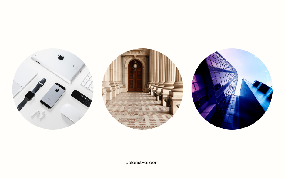
- Minimalist Style: Focuses on monochrome or low-saturation palettes, emphasizing simplicity and clarity. For example, Apple’s website design uses white and gray to highlight its products.
- Retro Style: Uses soft tones and nostalgic colors, such as beige and dark brown, often seen in handcrafted brands or vintage clothing stores.
- Futuristic Style: Combines cool tones (e.g., blue, purple) with neon effects to create a sense of technology and futurism, ideal for tech products or game design.
Designers are encouraged to create within each style, experiencing how different color schemes influence design outcomes and identifying the best style for their project needs.
Validating Color Schemes in Real Projects
Real-world projects are the best environments to test color coordination skills. Designers can apply their learned techniques to the following projects:
- Personal Projects: Design portfolio websites or brand identities to test the effectiveness of different color palettes.
- Client Projects: Adjust color strategies based on client needs, such as using bright and playful colors for children’s products.
- User Feedback: Gather insights through surveys or behavior analysis to understand the appeal of colors to target audiences and optimize based on feedback.
By combining theory with practice, designers can refine their color schemes, better meet user needs, and enhance their design professionalism.
Tips and Insights
Common Color Coordination Mistakes
Beginner designers often make the following mistakes in color coordination:
- Overusing Bright Colors
While bright colors grab attention, excessive use can make designs overwhelming and disrupt harmony.
Tip: Limit bright colors to one or two as accents, and balance them with neutral or low-saturation tones. - Insufficient Contrast
Lack of contrast between colors can result in unclear content, especially between text and background.
Tip: Use contrast in brightness or saturation to improve readability and test on different devices. - Ignoring Brand Consistency
Frequently changing color schemes for diversity can weaken brand recognition.
Tip: Maintain the primary brand colors in creative works to ensure alignment with the brand identity. - Neglecting Contextual Application
Failing to consider the design's usage context, such as using low-contrast colors in digital designs, can affect visibility.
Tip: Simulate effects in different scenarios to ensure the design works across various environments.
Building a Personalized Color Style
To develop a personal color style, designers should continuously experiment and draw inspiration. Here are some suggestions:
- Learn from Classics
Study classic designs and analyze how masters use colors to convey emotions and messages. For instance, learn modernist color schemes from Mondrian’s primary colors or gather vintage inspiration from Wes Anderson’s films. - Add Personal Creativity
Build on existing works by introducing your creativity, such as trying unique color combinations or incorporating unconventional pairings to make designs distinctive. - Practice and Experience
Experiment in real projects to find your preferred color logic. Gather user feedback to refine your designs and establish a unique style. - Create a Personal Color Library
Use tools like Coolors or Adobe Color to save your favorite palettes as a library for quick access and consistent styling in future projects.
By continuously learning and innovating, designers can discover their unique color style while effectively meeting diverse design needs.
The Key to Becoming a Color Coordination Expert
Color coordination is not just a skill; it’s an art. To become a master of color, designers need to develop three core techniques:
- Observe: Draw inspiration from nature, classic design examples, or everyday life to learn how colors harmonize and complement each other.
- Imitate: Familiarize yourself with color rules by imitating outstanding works, then gradually incorporate your creativity to improve them.
- Create: Practice repeatedly in real-world designs, use data and feedback to optimize your color choices, and ultimately develop your unique style.
Continuous learning and practice are essential for enhancing your color coordination skills, and designers will gain increasing confidence on this journey.
The Endless Possibilities of Color
Color is one of the most powerful tools in design, capable of evoking emotions, conveying messages, and shaping brand identity. As your skills improve and your perspective broadens, you’ll be able to explore even more possibilities in color coordination, creating works that are both impactful and visually stunning.
Whether it’s for brand identity, digital media design, or creative projects, mastering the art of color opens up limitless potential in design.Start practicing today and become a creator in the world of colors!