Whether it's brand design, website design, or social media content, effectively utilizing color theory can significantly enhance the professionalism and impact of your designs. This article introduces the fundamental concepts of color theory, including hue, value, and saturation, and shares practical tips on applying these principles to everyday design. Whether you're a novice designer or an experienced professional, you'll find valuable inspiration for your color palettes here!
What is Color Theory?
The Basics of Color Theory
Color theory is a system that describes colors and their relationships, providing guidelines to help designers create harmony and balance in visual design. It offers principles for selecting and combining colors to ensure designs are not only visually appealing but also effectively communicate messages. For example, understanding how colors complement or contrast each other enables designers to reinforce brand identity, improve user experience, and even influence consumer behavior. From choosing a brand's primary color to creating layered color schemes, color theory provides a solid foundation for design.
Color Wheel and Color Categories
The color wheel, also known as the color circle, is a cornerstone of color theory. It organizes hues into a circular structure based on the color spectrum, visually demonstrating the relationships between colors. According to the color wheel, colors are divided into three categories:
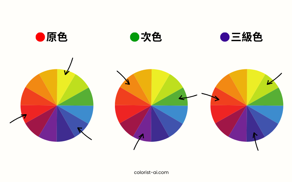
- Primary Colors: Red, blue, yellow. These are the base colors from which all other colors are created and cannot be mixed from other hues.
- Secondary Colors: Orange, green, purple. These are created by mixing two primary colors.
- Tertiary Colors: Red-orange, blue-green, etc., formed by blending primary and secondary colors.
The color wheel not only helps designers understand the structure of colors but also provides references for combinations such as analogous, complementary, and split-complementary schemes, making designs more engaging and professional.
The Three Attributes of Color
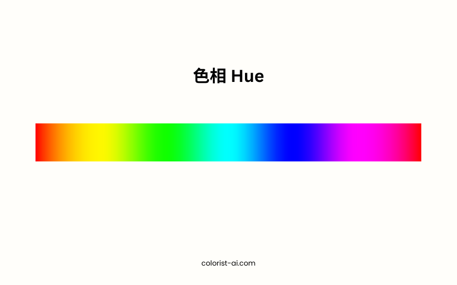
Hue
Hue is the basic attribute of color, determining the type of color, such as red, blue, or yellow. It is the most intuitive characteristic of color and the central concept of the color wheel. Hue significantly impacts the style of color combinations:
- Red: Represents passion, power, and energy, often used in food or entertainment brands to evoke emotion and action.
- Blue: Symbolizes calmness, trust, and stability, suitable for banking, technology, or healthcare sectors to convey reliability and professionalism.
- Green: Conveys a sense of nature, growth, and health, widely used by eco-friendly and organic product brands.
Understanding the characteristics of hue helps designers choose colors that best communicate messages, enhancing visual impact and brand recognition.
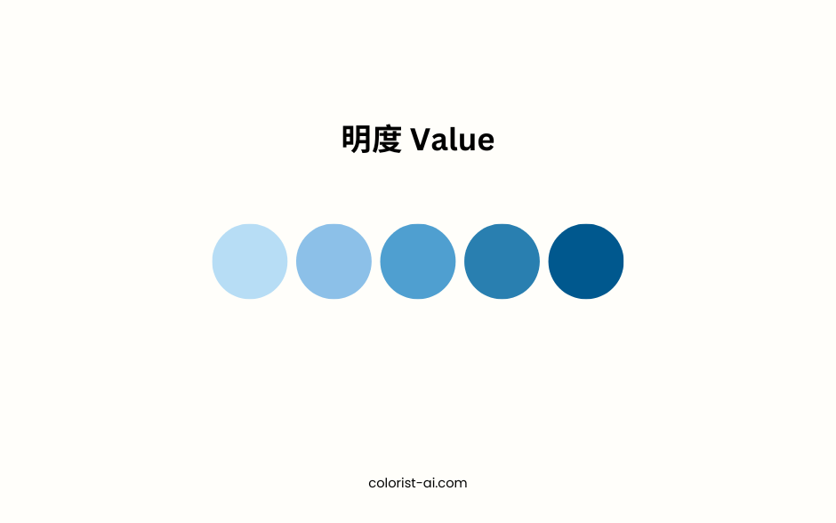
Value
Value refers to the brightness or darkness of a color and is a key factor in influencing the mood and depth of a design:
- High Value: Bright colors often evoke a sense of lightness and playfulness, suitable for children’s products or joyful brand images.
- Low Value: Dark tones bring a sense of luxury and seriousness, ideal for luxury brands or solemn themes.
In design, adjusting value can shift the overall visual focus:
- Increasing value softens the background, emphasizing foreground elements.
- Decreasing value enhances contrast, creating dramatic effects. For example, in website design, combining a dark gray background with high-value text improves readability and professionalism.
Saturation
Saturation describes the purity of a color, ranging from highly saturated to desaturated, reflecting the vibrancy or softness of the color:
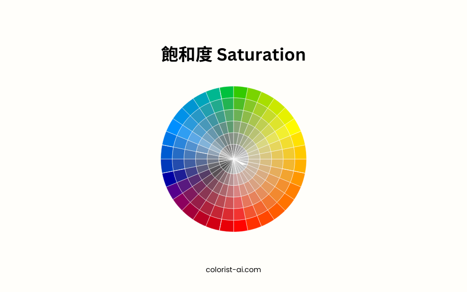
- High Saturation: Vivid colors grab attention, commonly used in promotional advertisements or prominent buttons.
- Low Saturation: Soft colors create a comfortable and subdued atmosphere, ideal for background colors and long-form content.
For instance, in health app design, high-saturation green can indicate health status, while low-saturation green can be used as a background to create a relaxing visual experience. Adjusting saturation allows designers to balance attraction and comfort, meeting the needs of different scenarios.
Common Color Schemes
Monochromatic Color Scheme
Monochromatic color schemes are the simplest approach, using a single hue and adjusting its brightness and saturation to create a layered, cohesive, and harmonious design.
.png)
- Advantages: Minimalist and professional, easy to control overall style, ideal for brand designs and minimalist websites.
- Applications: In tech company websites, using various shades of blue to convey professionalism; or employing soft greens to create a health-conscious and natural atmosphere.
Although simple, precise adjustments to brightness and saturation can achieve high consistency and strong visual appeal in the design.
Analogous Color Scheme
Analogous color schemes involve selecting three neighboring colors on the color wheel, such as blue, blue-green, and green, to form a harmonious and visually pleasing palette.
-1.png)
- Advantages: Warm and natural, suitable for designs needing a gentle touch, such as health, education, or family-oriented brands.
- Applications: On beauty brand websites, warm combinations of pink and orange are used to convey passion and energy, capturing the attention of the target audience and evoking positive emotions. Alternatively, green tones can be utilized in nature-related product packaging to showcase concepts of nature and sustainability.
Analogous schemes easily create continuity and comfort but require sufficient contrast to enhance depth and clarity in the design.
Complementary Color Scheme
Complementary color schemes use two opposing colors on the color wheel (e.g., red and green, blue and orange) to create strong contrast and visual interest.
.png)
- Advantages: Highlights key information and elements, perfect for designs needing immediate attention.
- Applications: On e-commerce promotion pages, pairing orange buttons with blue backgrounds to emphasize call-to-action buttons; or in sports branding, using red and green contrasts to amplify strength and energy.
This scheme must be used carefully to avoid overwhelming users; adjusting brightness and saturation can help balance the overall visual effect.
Triadic Color Scheme
Triadic color schemes select three evenly spaced colors on the color wheel, such as red, blue, and yellow, to create a vibrant and balanced design.
.png)
- Advantages: Bright and diverse, suitable for creative or energetic design styles.
- Applications: In children's education websites, using yellow, green, and blue to convey fun and energy; or in festival promotions, using three contrasting colors to grab attention.
Triadic schemes offer extensive design possibilities but require skillful balance of primary, secondary, and accent colors to avoid clutter.
These four common color schemes range from simplicity to vibrancy, and harmony to contrast, providing diverse options for designers. By adapting these methods to different needs, designers can create visually appealing designs that are both functional and aesthetically pleasing.
Practical Applications of Color Theory
Applications in Brand Design
Colors play a vital role in brand design, helping communicate core values and establish emotional connections with consumers.
- Brand Examples: Coca-Cola’s red symbolizes passion and energy, evoking joy and sharing among consumers. Facebook’s blue conveys calmness and trust, reinforcing its image as a stable social platform.
- Tips for Application: When selecting brand colors, designers should consider the psychological impact and cultural connotations of colors. For instance, green is often used for health or eco-friendly brands, while orange is frequently chosen for attention-grabbing promotional campaigns.
Applications in Digital Media Design
Color theory is crucial in digital media design, directly influencing user experience and interaction.
- Web Design: Choosing the right color schemes can guide user focus and enhance readability. For example, e-commerce sites often use high-contrast colors to highlight purchase buttons.
- Advertising Design: High-saturation colors can capture attention within seconds, such as red sale tags in social media ads.
- Social Media Content: On visual platforms like Instagram and Pinterest, consistent color schemes enhance brand recognition and attract more followers.
Design Inspiration in Everyday Life
Color inspiration doesn’t only come from theory but also from everyday life.
- Inspired by Nature: Observing color combinations in flowers, landscapes, and weather changes helps understand natural harmony, such as the soft peach and lavender hues of a sunrise.
- Artistic Works: Learn from masterpieces like Van Gogh’s "Starry Night," which uses deep blues and golden yellows to create dramatic effects.
- Daily Observations: Find inspiration in fashion, urban architecture, or restaurant interiors. These environments can spark fresh ideas for innovative color combinations.
Color theory is not just a technical skill; it’s a source of creativity. From branding to digital media and everyday inspirations, mastering the art of storytelling through colors can make your designs more captivating and impactful.
Learning color theory is only the first step; the true value lies in practice. Apply the knowledge gained from this article, experiment with various color schemes, and observe how they affect user experience and emotional response. Don’t forget to continually draw inspiration from nature, art, and technology to refine your skills and elevate your designs. Start your color journey today and create works that are both visually stunning and emotionally resonant!