This article delves into the psychological effects of color, analyzes well-known cases, and provides practical tips for effective color usage. Discover how to harness the power of colors in your designs to achieve more impactful communication and higher conversion rates.
The Connection Between Color and Psychology
Why Does Color Affect Emotions?
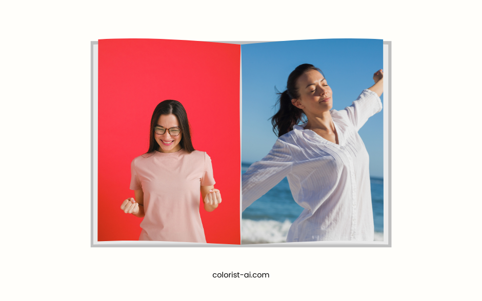
The impact of colors on emotions has been scientifically proven, primarily due to human physiological responses and psychological mechanisms. For instance, red can increase heart rate and enhance alertness as it stimulates the sympathetic nervous system, putting the body in an excited state. On the other hand, blue can lower heart rate, evoking relaxation and calmness, making it ideal for situations requiring emotional stability.
Colors are also linked to psychological associations. Bright yellow often reminds people of sunlight and hope, thus fostering optimistic emotions. Conversely, dark gray may evoke feelings of oppression or seriousness, making it suitable for conveying a solid and professional brand image. These reactions provide valuable insights for designers to leverage colors in conveying emotions and messages effectively.
Cultural and Contextual Influences of Color
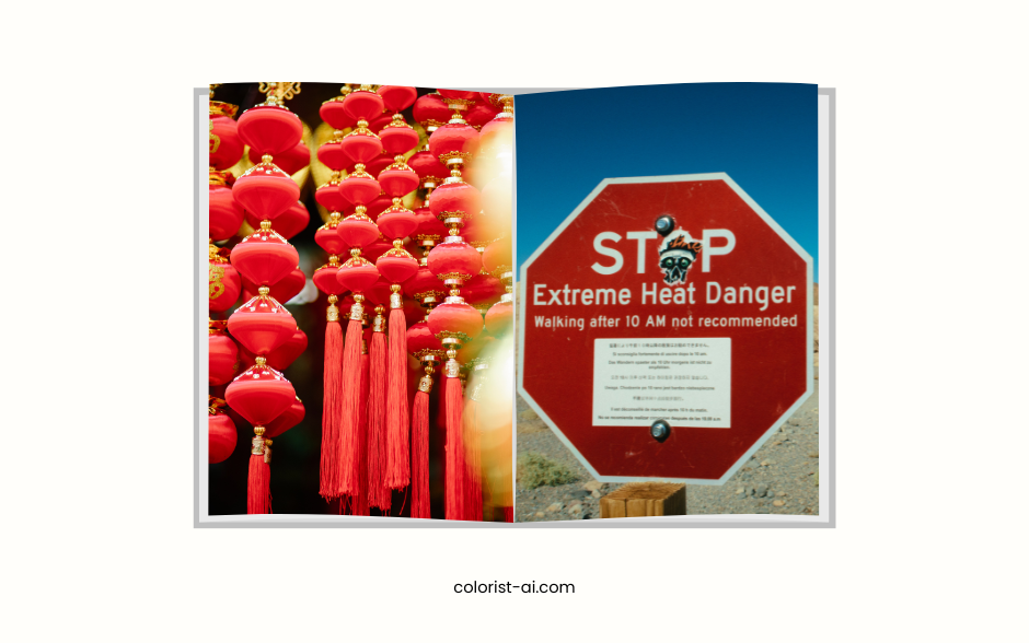
The meaning of colors can vary significantly based on cultural backgrounds and usage contexts. For instance, red symbolizes good fortune and celebration in Eastern cultures, often seen at weddings and festivals. However, in Western cultures, red is more associated with danger, warnings, or passion, frequently appearing in traffic signs or promotional events.
Another example is white. In Western culture, it represents purity and weddings, while in some Asian countries, it may symbolize mourning and funerals. Therefore, when designing for cross-cultural audiences, designers must deeply understand the cultural norms of their target market to avoid misunderstandings or discomfort.
Additionally, color interpretations can differ based on the context. For instance, blue conveys stability and trustworthiness in financial institutions but may lack appeal in food branding since it is rarely associated with natural foods. Designers must adapt their use of colors flexibly to align with cultural and contextual nuances, creating more effective designs.
Psychological Effects of Colors
Red: Stimulation and Urgency
Red is a powerful and attention-grabbing color. It is frequently used in promotional labels and emergency notifications because it stimulates purchasing desires and creates a sense of urgency. For instance, McDonald's leverages red to enhance appetite and encourage faster decision-making. Additionally, red evokes emotional associations such as passion and love, while also conveying warnings and danger.
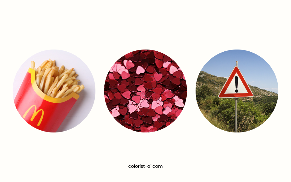
Due to red's dual nature, designers should carefully consider its context. Excessive use of red may create stress, so balancing it with other colors can achieve the ideal visual and psychological effects.
Blue: Trust and Calm
Blue conveys stability and trust, making it a popular choice for financial institutions (e.g., Visa) and tech companies (e.g., Facebook). It promotes calmness and relaxation, making it ideal for brands that emphasize professionalism and security.
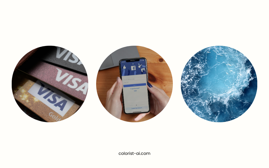
Blue is also known to reduce anxiety, making it a common choice for health and meditation products. Furthermore, blue encourages rational thinking, which is why it's frequently used in trust badges on e-commerce websites.
Green: Nature and Balance
Green symbolizes nature, life, and balance, making it the go-to color for eco-friendly brands and health products. For example, Starbucks' green logo conveys freshness and health while reinforcing the brand's commitment to environmental values.
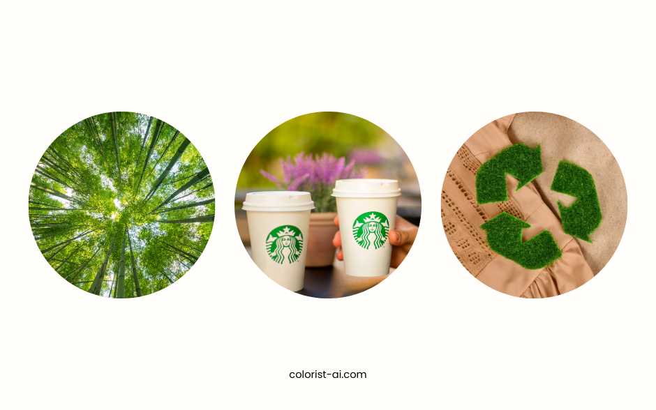
Green also induces relaxation and calmness, evoking outdoor natural scenes. It is particularly effective in creating a comfortable and refreshing atmosphere in design.
Yellow: Optimism and Caution
Yellow is an extremely vivid color that quickly grabs attention, often seen in traffic signs and advertisements. It also conveys friendliness and warmth, such as IKEA's use of yellow to enhance its approachable image and cheerful ambiance.
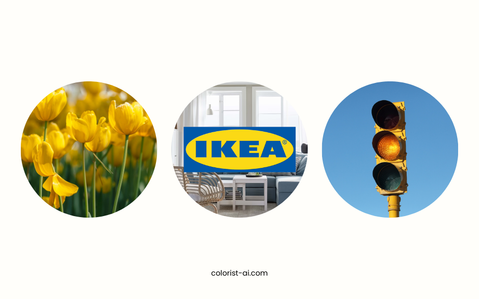
However, overuse of yellow can lead to anxiety, particularly in large areas, which may overwhelm viewers. Designers should use yellow cautiously, balancing it with other colors to minimize potential negative impacts.
Purple: Creativity and Luxury
Purple is strongly associated with creativity, mystery, and luxury. It is commonly used in high-end branding, such as cosmetics and luxury fashion, to convey quality and uniqueness.
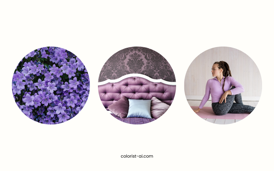
Purple uniquely balances red's passion and blue's calmness, making it both warm and serene. This quality makes it an excellent choice for meditation apps or mental health product interfaces, helping users achieve relaxation and focus.
When using purple, designers should choose appropriate saturation levels. Dark purples convey dignity and authority, while light purples (e.g., lavender) are better suited for soft and romantic themes, creating a light and delightful visual experience.
Case Study: The Impact of Colors on Behavior
Color Strategies in E-Commerce
Colors play a crucial role in e-commerce by attracting consumers and driving purchase actions. For example, platforms like Amazon widely use red promotional buttons, as this high-energy color stimulates buying impulses and creates a sense of urgency. Meanwhile, blue is commonly used for payment pages or trust symbols, such as PayPal’s branding, to enhance user confidence and a sense of security.
These strategies demonstrate that e-commerce color choices must not only grab attention but also align with specific contexts to help users make quick decisions, ultimately improving conversion rates.
Color Selection in Brand Identity
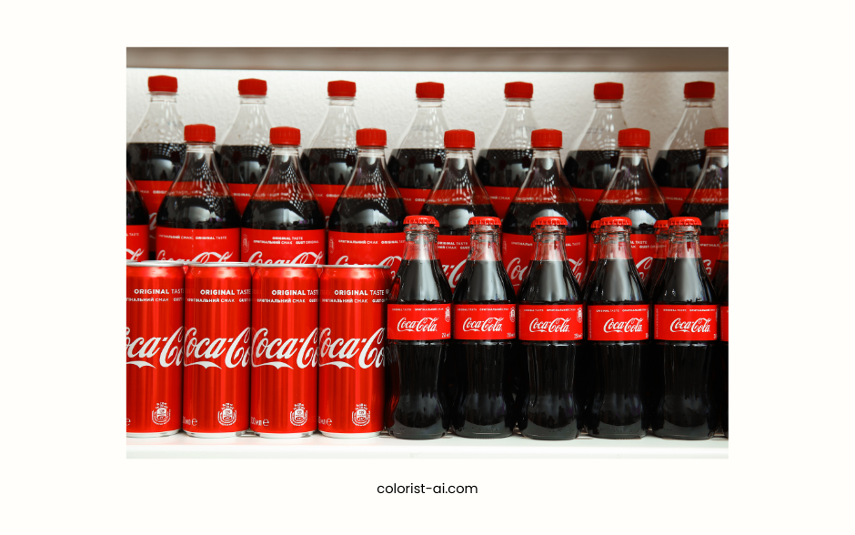
Color selection is critical for brands as colors have a profound impact on emotional connections with consumers. For instance, Coca-Cola’s vibrant red conveys passion and energy, evoking celebratory and communal moments. In contrast, Nike’s black-and-white palette emphasizes simplicity and professionalism, resonating with the brand’s core athletic values.
These successful examples show how colors become an integral part of a brand, helping it establish lasting recall and loyalty in a competitive market.
Enhancing User Experience in Website Design
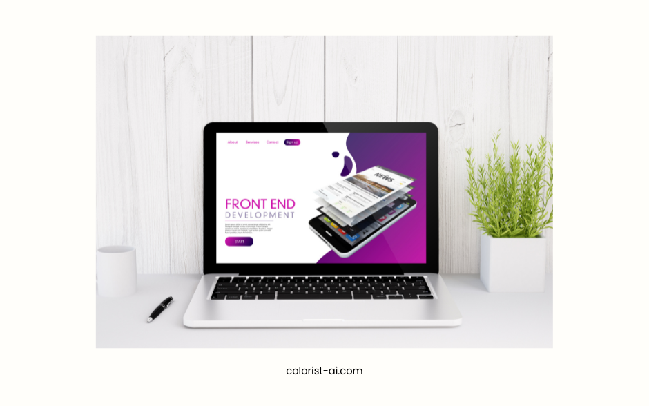
Colors directly influence user actions and experiences in website design. High-contrast button designs (e.g., deep blue buttons with white text) improve visibility, capture attention, and encourage clicks.
Additionally, the contrast between background colors and primary text colors affects overall readability. For example, using a soft light gray background with black text helps reduce visual fatigue and provides a better reading experience. By leveraging colors effectively, website design can not only attract users but also enhance interactivity and boost final conversion rates.
How to Use Color Psychology in Design
Choosing Colors Based on Target Audience
When selecting colors, it is essential to understand the cultural background and preferences of your target audience. For example, in Asian markets, red is often seen as a symbol of joy and good fortune, making it an ideal choice for festive promotions. In Western countries, blue is widely used by financial institutions and tech brands to convey trust and professionalism.
Additionally, color preferences vary across age groups. Younger audiences may prefer bright, bold colors, while older users often gravitate toward softer, muted tones. Designers should choose colors based on audience characteristics to ensure the message aligns with market expectations.
Testing and Data-Driven Decisions
The impact of color choices can be validated through data testing. For instance, A/B testing different button colors (e.g., red vs. green) to compare click-through rates can help designers understand which palette better aligns with user behavior.
In addition to quantitative data analysis, user feedback is also valuable. User testing can reveal whether specific colors effectively convey brand value or improve user experience. These insights allow designers to continuously refine their color strategies, leading to higher conversion rates and user satisfaction.
Colors are more than visual elements; they are powerful tools for influencing emotions and behavior. By leveraging color psychology, designers can more accurately convey brand value, guide user behavior, and enhance the impact of their designs. Whether it's building brand identity, optimizing website user experience, or running marketing campaigns, colors play an irreplaceable role. Understanding and applying the psychological effects of colors will make your designs more strategic and goal-oriented.
Color psychology is not a fixed set of rules but a flexible and creative design tool. Designers should adapt their use of color psychology to specific needs and contexts, adding emotional depth and appeal to their designs. By testing and incorporating feedback, they can continuously improve their color strategies, ensuring every design effectively communicates and resonates with its audience. Let colors be the language of your design, telling your brand story and creating unique user experiences.